


")
Ceci est une ancienne révision du document !
Pixel-art literally means that art is made thanks to pixels … such a bit global word since 3D and other things are also made with pixels … Actually pixel-art is used for pictures made with drawing/picture editing softwares (as MSpaint, photofiltre, paint.net, photoshop, the gimp, and so on and so on …). Unlike some people's thoughts, we aren't going to paint pixel by pixel … (fortunately !), only when there are very small parts of the pictures to make. Hopefully mankind advanced its technology and thanks to homo-sapiens-computerus, many usefull tools as photofiltre - which we'll use - which can make lines, gradients, and many cool stuff.
So pixel-art needs some patience and time to spend, of course, the result's quality depends on the time spent to work on. But as it's said : when you love it does not ! Plus : with pixel-art we can easily as good results as in 3D, when you know the way to do good things. Seeing many 3D creations which are really not nice, I can say that in pixel-art we can easily to better than 3D.
Stop saying craps, let's starting the tutorial. Each part of this tutorial has exercices which are important to do, links to the photofiltre introduction's page each time it's necessary.
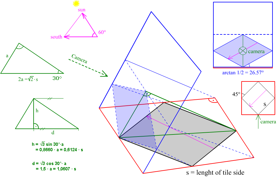
A last thing to know : for Simutrans graphics are in isometric viewpoint, so we'll have three perpandicular axes : length, width, height which are in Simutrans North-South, East-West, height. Let's see that :

In pixel-art, pictures are almost made side by side, but to exist, a side needs edges limited by lines. Let's see this :
Look this source picture (it's a simple station extension).
 Two axes are easily noticed : North-South axis with top left and bottom right edges and East-West axis on the other sides. These lines are completely visible, but you know that your screen is made of pixels, so to draw diagonal lines we have to cheat with pixels … see :
 We can see by zooming in that edges are crenel shaped. We can also see that there's two pixels width for one pixel height, and it composes the line. Maths'addicts say that there are lines what their equation are y=0.5x and y=-0.5x.
So this is what you have to see :

Two pixels width and one height, it's a base of Simutrans'graphics, you have to know it and it must be the first thing that comes to your mind when you draw. You draw in a rhombus with a great diagonal of 128 pixels (or other according to the paksets) and you have to see with this angle.
This is the result that you must have :
Lines'drawing is important, it's the structure of what you build. However you can see in the exercise above that there's a pixel in excess at the bottom right of the first line and the top right of the second line. It's a photofiltre's problem, this pixel shoudn't be here … you can remove it. Even you know how to draw lines with the line tool, this tool isn't practical to use on small parts, you have to know how to draw lines pixel by pixel to gain some time (one pixel above, two pixels on the right, one pixel above, two pixels on the right, …).
To make this knowledge of lines perfect, let's see how it is on the corners of a tile.
 Notice here the combination of the both lines. On the left, to make bottom and top corners, lines are put beside each other, so we have a four pixels corner composed of the extremities of each line. On the right these extremities are merged as you can see with twice colored pixels. Practice by reproducing the corners with the paintbrush tool and the max zooming in.
The paintbrush tool in Photofiltre
To end lines : a small exercise :

Of course we can't see lines of objects in Simutrans, they're virtual. However we can guess them watching sides of objects, indeed lines determine sides that compose the object. This is what I mean :
 Here we can't see lines on the right graphic. In fact, even it's possible, lines of an object are never drawn before sides, sides are directly drawn. Maybe it looks a bit difficult for a beginner bu finally it's much simpler. Let's start with a simple cube … We are going to make a 64 pixels sided cube. We have three sides to draw, the top side will be exactrly like a simple tile : a 64 pixels sided square which appears like a rhombus on the screen. Draw it (in light grey or with a color, as you wish).
Then the South side is drawn, in a lighter grey or in another color by this way : draw two vertical lines of 32 pixels at each extremity and draw at their bottom a 64*32 px line. See :

Finally we have to fill this shape, make the other side repeating this or copying, pasting, horizontal symmetry, place the selection to have the Eastern side and unselect. In this case you have to sides same colored, make the selection appear with show selection icon, fill the light grey side with dark grey.
This is the result : a cube !
 So cubes are nice and very simple but it's not all the pixel-art, how to create more complicated shapes ? For polyhedrons (with flat sides) we are going to see it, for cylinders, spheres, and other such rounded things we'll see it later because it's necessary to learn other things.
Think you have to make a section of the cube as defined by the red lines :
 To make sections, if you have well defined it (copy the picture and zoom in to see the details), it's very simple. Draw along red lines, other lines which are colored with the color of the future side. Here a lighter grey is used. Draw lines along the section (if you drew red lines before you can use “replace color”).
This is the result, then as indicated on the picture, remove pieces in excess and fill the other ones :

I think you understood however let's see how to draw sides one by one.
For top faces it's already explained above. For a lateral vertical side, you just have to draw an horizontal line (horizontal according to space, not on the screen) and extend its extremities with vertical lines, close the shape and fill it. See some schemas :
 Here I used a usual direction fot the base line but you can use any direction, as long as lateral side are vertical you'll have a vertical side. Of course we can maje non rectangular sides, see here :
 Non rectangular sides can be intuitive when you are used to them but you can be helped by a structure, like here in grey, which you remove at the end of course. Thanks to this structure, you can create some strange shaped sides …

Don't worry, such shapes aren't usually directly made, they're mostly created by the intersection or the merging of simpler shapes …
It's the same way for inclined sides : you can make them intuitively like the pixel-art master with his eagle eye and his perfect spatialization or you can make a tridimensional grey structure which is removed at the end like a newbie reading a tutorial :
 So, with this we can make everything except rounded sides, we can make the shape we want ! Then, you're going to make the shape I want !
 1) Draw the first side with the defined dimensions (use the same color, it's important).
 2) Draw the red lines thanks to the red dots. Keep only their part between the base and their intersection. The rest is removed. It's the beginning of the roof.
 3) Create a extension on the first side. Notice the exact shape of the corners !
 4) Create a second extension on the first one. Be careful again with the corners'structure. Then draw a line between the two red dots.
 5) Then, begine the roof. Define with a red line the limit of the roof. I zoomed in structures of the corners which get a bit complicated …
 6) You see that the first line of the roof is 46*23 px, reproduce it on the two other corners.
 7) Link with the other side …
 8) The lines aren't really of the right color, recolor them with the color of the side they will be part of. Try and check with this picture …
 9) End by filling ! this is ou future first building, keep it we are going to use it later …
As you saw in some shapes above, sides are defined mostly with their lighting. Indeed as in real, Simutrans has a Sun, which is stationary. It shines on the South and its rays come to the ground with a 60° angle as shown on this picture :
 We can define the lighting by maths but don't worry I'm not going to do this for this time.
Before seeing complicated things, see how it just works. On these screenshots of the game, you can easily see that the most lighted sides are Southern ones :
 Notice that, since the angle between the Sun's rays and the ground is 60°, the top sides of objects will be more lighted than lateral Southern sides.
Here is a cube to explain this :
 The top side is the most lighted, then the Southern side is well lighted and the Eastern one is the less lighted.
 This is the solution, of course the pink and the yellow sides are same lighted since they're symmetricaly placed on each side of the North-South axis. Except some ambiguities, here is the result you must have :
 Let's invent other shapes to light to practice.
currently, knowing that the Sun lights with an angle of 60° with the ground, we could do some trigonometry but we aren't going to do such an horror.
With buildings, when sides are too big, a simple color can give a void impression … So textures are used.
Of course we have to adjust the orientation of the texture we have. There are two ways to do it.
Firstly choose a texture to apply to the side. Copy this picture in photofiltre :
 As you can see the sides we have to texture aren't as orientated as the texture. We have to adjust it. Copy it in the same picture and go in free transformation. Incline vertical axis by -50%.
We must have this. Let it here.

We are going to see the second way. Cut the original (keep it in the clipboard or somewhere else). This texture was 86*63 pixels. Draw a parallelogram 63 pixels height and which bases are 86*43 px. This is the result :
 Paste the original texture, its right side must be on the right side of the parallelogram. Then right click\distort, place the left corners on the parallelogram's ones. This is the result :

Here textures aren't placed normaly according to the sides we are coing to texture. It's a mistake, do a vertical symmetry on the textures.
Now let's prepare the shape we are going to texture. Make an horizontal selection around and color the background of the selection with a showy color (red for example).
The following process consists in applying the lighting the the sides to the texture. If they're just pasted on with transparency, the texture is going to lose colors. So we are going to make its colors brighter. Select it, filter\color\colored layer and do a inverted layer with 127/127/127 grey with 50% transparency. So the color we are going to remove with our sides'grey is added.
See the result :
 Now copy and paste the sides on the texture with a 50% transprency, check that grey sides are well placed on the texture's sides. This is the result :
 Now we have to remove the borders which are useless. Paste the same selection with no transparency and the grey transparent. Place it at the right place. Then clean the result by removing the red and the texture's pieces in excess : so these are bricks walls :

We are going to see something very important to make your graphics much nicer. See the result : on the left is the picture before and on the right is the picture after, free to you to conclude …
 borders are made softer and more real. How does it work : when you draw a diagonal line, as seen at the begining of this tutorial, there are crenels, the problem is that we can see these crenels on the final result … and it'd definitly ugly ! We have to make them disappear by making the lines softer. Anti-aliasing process can be seen on pak128 graphics, graphics which haven't such one are usually not included in the pakset.
Let's start serious things ! We are going to start by simple things to explain the several ways of antialiasing.
The most simple : antialiasing is made only on one side of the line :
 This is the result we will have. Notice the pixels'structure … on the left is the base structure. On the right I highlighted pixels which are going to be antialiased.
 You can see that antialiased pixels are ones which are in the crenels. But how to antialias them ? How to make the line “softer” ? Simple : there's a crenel effect because the color difference is big, the limit is brutal, and it can be seen easily since pixels are squares. We have to reduce the contrast between the two colors. The pixels inside the crenel are going to me mixed. In this case it will be 50% of each color, and this is the result :
 How to do that ? Here is a color mix, the most practical way to do it is by zooming in to the max and use the line tool on only one pixel with one of the two colors and 50% transparency on the other color.
Notice that the line tool has a parameter “antialias”, it can be used in a few situations because the antialiasing of lines isn't very good for this use.
Now see a second way : a bit more complicated. Taking the same example, this is the result with the second way :
 If you look at it well, you see that the border is softer than above. This time pixels are modified on each side of the line :
 But this time we don't use 50% opacity using the line tool, because we would have a central line with every pixel of the same color whereas the purpose is doing something like a gradient between the highlighted pixels. So on the pixels of the color 1 we are going to mix 33% of the color 2 and on the color 2 33% of the color 1. See :

Lines in Photofiltre Antialias this buidling too :

There's a problem : all lines aren't 1*2 or 1*1 pixels, how to antialias other lines ??
There are two possible ways to do. You can do the same as the other lines : play with the transparency :
 Or use the line tool with antialiasing on on small parts of the line :
 Here the red pixels'color is used : dark grey. Then reproduce all. You can draw all the line in one time but be careful with the Photofiltre's line tool …
Result :
 Nicer, isn't it ? The antialiasing is really important for graphics, you MUST do it.
There are in Simutrans special colors to do a lot of useful things but they can be a pain too. Here they are :
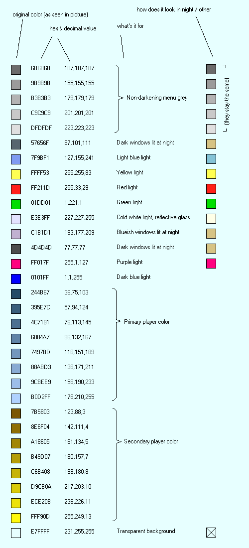 Okay it's not very easy like this … let's explain it :
You can see that for each color you have an hex code, useful to use it in Photofiltre witheout loading a picture containing these colors.
This is a more compact form for special colors :
 There is not exactly two packages of colors, the second one is explained below. The first one contains on the first line the player color 1, on the second line the player color 2. The other lines are divided into three rectangles. The first one is for lights, then the second one is for windows (the windows which isn't lighted with the same color as others is pointed with a red dot) and the third one is for non darkening greys and the background color (at the bottom left of the rectangle).
But sometimes drawing some special colors which aren't supposed to appear do so, to remove them you just have to change them by one RGB unit, the second package of colors are wrong special colors to replaced these bothering special colors. Use the replace color tool to replace them.
Let's end this part with some examples of special colors use on this piece of z22500 source picture.
To make a rounded aspect, gradient is used. A gradient between the lightest and darkest color is done, if the picture is going to be textured, the gradient is made of grey.
Easy to do thanks to gradients, it's also an example … This is the cylinder that we want to light :
 The blue part has to be lighted, knowing that the Sun shines on the South. Colors are going to be constraster so we can apply a texture then. We have to mark the extremities'colors and the lightest color :
 Then the distance between each line is measured with line counted and the gradient is made on another picture between these colors :
 For the end, the blue cylinder is pasted on these gradients with blue as transparency color :
To draw a circle parallel to the ground in Simutrans, draw an ellipse which the width is two times bigger than the height. Avery shape drawn parallel to the ground is the same shape but half heighted.
The other rounded shapes are based on the same way but we can't make a gradient directly to draw them. The easiest way to do them is to draw the different lightings with showy colors, then a gradient is made between the darkest and the lightest color and the showy colors are replaced by the gradient's colors.
The goal is to give a realistic mirror effect on sides as a skysraper's side (of course this can be done with other materials and other objects …).
This is the awful thing that we are going to make a bit nicer : The effect will be done on the blue part of course. This is the sky that we are going to use :
 As texturing different parts of an object, we are going to make a second building from the first one replacing the glass side by a red side. We can do it with selections in Photofiltre :
To apply this piece of sky to the building, we use transpareny, between 30 and 70% according the effect you want, here we will use 50% transparency to paste the first picture on the sky. Here is the result : Of course we want to keep only the glass side of the building, the second picture is pasted on this one with red transparent :
We could also apply this effect only on the blue part of the glass side, we had to make a red picture using the replace tool of Photofiltre, or pasting directly with blue transparent.
Pas vraiment de démonstrations pour cette technique … il s'agit d'ajouter une touche de réalisme aux objets en rendant extremement lumineuses les surfaces éclairer verticalement par le Soleil ou presque. On n'hésite pas à utiliser du blanc pour ces surfaces mais en fait il s'agit généralement de quelques pixels. Voyons des exemples :
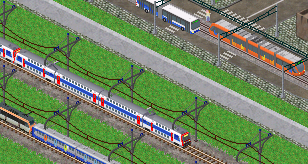
rvg_tigress :  On distingue le trait très clair sur la bande orange tournée vers le Soleil.
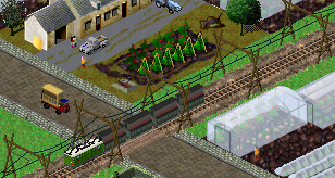
SNCF_z5300 : Ici l'effet a été poussé à l'extrême car le z5300, familièrement nommé “petit gris”, est métalisé. L'effet de reflet réaliste peut donc donner une information visuelle sur la nature de l'objet. Voyons d'autres exemples pour terminer :
Afin de reprendre presque toutes les techniques vues sur ce tuto, nous allons faire ce bâtiment : Il n'est pas spécialement beau mais il permet de reprendre pas mal de techniques. Attention je ne détaillerais pas plus que ça les étapes vu que chaque technique a déjà été vue plus tôt !
On va commencer par construire chaque partie du bâtiment, n'hésitez tout le long de l'exercice à copier une image pour zoomer et bien voir ce qu'on fait.


Voila pour la construction de base. Ensuite il s'agit d'anti-créneler le tout. Faites des anti-crénelage sur deux cases pour les lignes gris-gris et gris-bleu foncé, et des anti-crénelage sur une case pour les autres (zoom sur cette image pour plus d'infos) : On a donc ici une vision de ce que deviendra le bâtiment. Mettons des fenêtres plus réalistes et une petite allée entre la porte et le trottoir :
 La manipulation qui suit est un peu complexes : en texturant le bâtiment on aura besoin de mélanger les textures au niveau des anti-crénelage. Avec un peu d'organisation voici ce qu'on fait : faites trois copies de l'image et grâce à l'outil baguette magique faites très facilement trois images avec des pixels rouges pour les pixels d'anti-crénelage 67%, 33% et 50%. Voir image poir plus de compréhension :
 Voila les images qu'on obtient en supprimant sur chaque copie tout ce qui n'est pas rouge (en jouant sur les sélection et grâce à l'outil baguette magique) :


On va ensuite commencer par texturer les fenêtres puis le sol : sur deux nouvelles copies de l'image isolez chaque fenêtre et le bleu du sol, l'anti-crénelage lié à chacun sera compris dans l'image en étant recolorié comme si c'était pas un anti-crénelage (voir image …..) :


Texturez les respectivement avec les images suivantes :


en suivant la méthode d'effet vitre pour les fenêtre : coller avec 50% de transparence et coller le contour par-dessus; et tout simplement avec le bleu transparent pour la troisième image, mettez le tout dans une même image, voici le résultat :
Texturez l'image principale sur la texture suivante avec 50% de transparence (collez avec la transparence puir coller les contours que vous aurez sélectionné avec l'outil baguette magique), il faut mettre tous les anti-crénelage en gris pour cette opération (voir image pour plus d'info).


C'est ensuite qu'interviennent les images en points rouges faites tout à l'heure. Il nous reste les images en point rouge, les deux images ci-dessus. Faites trois copies de l'image avec les vitres et le sol texturés et collez sur chacun d'elle les images en pointillés avec le rouge en transparence. Vous obtenez des pointillés comme sur cet exemple : Collez également les trois images de pointillés rouges successivement avec le fond en transparence sur l'image avec vitres et sol texturés, et supprimez les pixels en rouge. Ensuite c'est la fin : collez les pointillés sur l'image avec le bâtiment texturé avec les transparences adéquates (33%, 50% et 67%) avec fond totalement transparent et collez l'image avec vitre et sol texturés avec fond transparent. Voici le résultat :
 Pour terminer, utilisez ces fenêtres comme vous voulez pour agrémenter le bâtiment (pour les mettres sur les surfaces en pente, utilisez la distorsion ou l'inclinaison). Voici un résultat possible :

L'idéal pour ce bâtiment aurait été d'incliner la texture de béton selon les faces du bâtiment, mais en comprenant les anti-crénelages cela aurait été beaucoup trop fastidieux. Bien entendu c'est le cas uniquement lorsqu'on utilise des textures, pour des objets plus petit on n'utilise très rarement des textures ce qui raccourcit énormément le travail.